How to Choose a Retro Gas Pump Sign for Your Business?
Choosing a Retro Gas Pump Sign can shape how customers remember a business before they enter. Its colors, scale, and materials should support the brand rather than compete with it. A weathered red finish may suit an auto workshop, while polished metal can complement a modern diner. Small details matter.
This guide examines practical choices from a business owner’s perspective. It considers placement, visibility, construction quality, lighting, maintenance, and customer safety. A sign beside a busy road needs bold lettering and strong contrast. A wall-mounted sign may require lighter construction and carefully planned brackets. Outdoor exposure also changes the decision. Sunlight fades paint, rain tests finishes, and dust gathers around raised lettering.
Reliable selection depends on more than appearance. Check the sign’s dimensions, mounting hardware, electrical specifications, and warranty before ordering. Materials such as powder-coated steel, aluminum, or treated wood offer different strengths. Local installation requirements should also be confirmed with qualified professionals. Details vary by location.
There is no perfect design.
A common mistake is choosing a sign from a product photograph alone. The sign may look impressive online but appear oversized above a narrow entrance. Measuring the facade first can prevent that disappointment. It also helps to view finish samples in daylight. Color can shift under warm bulbs.
The right Retro Gas Pump Sign should feel authentic without creating confusion about the business. Thoughtful proportions, durable materials, and clear branding create a more trustworthy result. Some choices may still need revision after installation, and that is normal. Good design leaves room for observation, maintenance, and honest improvement.
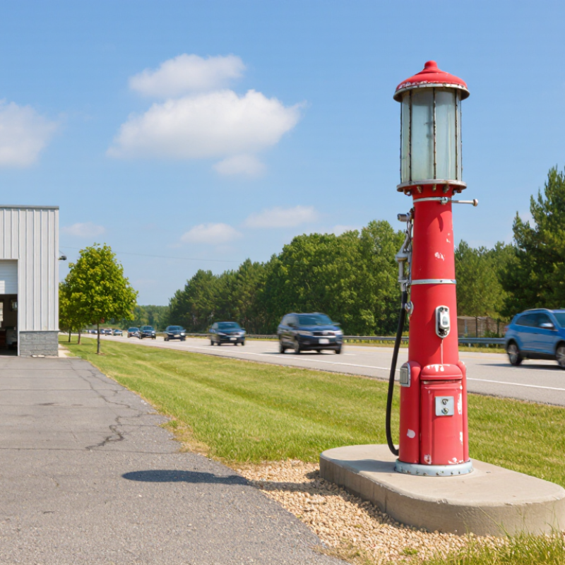
Define Business Goals and Placement with NFPA 30A Fuel-Site Safety Standards
Choosing a retro gas pump sign should begin with your business goal, not its color or nostalgic shape. Decide whether the sign supports customer wayfinding, storefront identity, or a themed display. A large illuminated sign may attract attention, but it can also create glare near vehicle paths. Sketch the entrance, fuel dispensers, parking spaces, and pedestrian routes before ordering.
NFPA 30A focuses on fire safety at motor-fuel dispensing facilities. Its requirements can affect sign placement, electrical components, clearances, and ignition-source control. Keep decorative signs away from dispensers, vents, fill points, and emergency equipment unless the design is suitable for the classified location. Ask a qualified electrical professional to review wiring and equipment ratings. Confirm the current edition and local adoption with the authority having jurisdiction.
In practice, the safest location is often visible from the driveway but outside hazardous areas. A freestanding sign may need stronger anchoring for wind and vehicle impact protection. Wall mounting can reduce traffic exposure, yet it may obstruct lighting or service access. Check that the sign does not hide emergency instructions. I once favored a visually perfect placement that reduced nighttime visibility around a pedestrian lane. That choice looked right on paper, but it needed revision. Leave service clearance, use durable weather-resistant materials, and document the final distance from fuel equipment. Safety should shape the design before nostalgia does.
Set Sign Dimensions and Viewing Distance Using ADA 2010’s 4-Inch Projection Limit
How to Choose a Retro Gas Pump Sign for Your Business?
A retro gas pump sign should be sized around real viewing conditions, not decoration alone. ADA 2010 Standards, Section 307.2, limit wall-mounted objects to a 4-inch projection when their leading edges sit between 27 and 80 inches above the finished floor. This matters beside entrances, sidewalks, and narrow fueling areas. Measure from the finished walking surface, not from soil, gravel, or a curb.
Keep it visible.
The Sign Research Foundation’s sign-legibility guidance commonly uses one inch of letter height for every ten feet of viewing distance. Thus, a sign viewed from 40 feet may need lettering near four inches high. This ratio is a planning aid, not a universal guarantee. Contrast, glare, weather, and nighttime lighting can reduce readability. The Federal Highway Administration’s Manual on Uniform Traffic Control Devices also emphasizes legibility, contrast, and adequate viewing time for roadside information. Those principles transfer well to commercial signs, although a private business sign is not a traffic-control device. In practice, place the sign outside the 27-to-80-inch zone when possible, or keep its projection within four inches. A mock-up at eye level can reveal problems quickly. It may look slightly oversized up close. That is often acceptable. A mistake is choosing a charming sign that disappears from the driveway. Review local accessibility requirements before fabrication, because site conditions and adopted codes may add stricter limits.
Choose UL 48-Certified Electrical Components and NEC-Compliant Wiring
How to Choose a Retro Gas Pump Sign for Your Business?
A retro gas pump sign should look nostalgic, but its electrical system must meet modern safety expectations. Choose an assembly certified to UL 48, the standard covering electric signs and illuminated displays. Ask for certification records, component ratings, and installation instructions before purchasing. UL 48 helps address insulation, grounding, enclosure strength, and fire resistance. It is the right starting point.
NEC-compliant wiring matters just as much. A qualified electrician should select the branch circuit, disconnect, grounding method, raceway, and weatherproof fittings. Outdoor signs face rain, condensation, sunlight, and temperature changes. According to NFPA’s Electrical Fires report, electrical distribution and lighting equipment caused an annual average of 35,150 U.S. home structure fires from 2015 to 2019. Commercial settings differ, but the warning remains relevant. A loose connection can become a serious heat source. I once underestimated moisture near a sign base; that small detail deserved more attention.
Tips: Request the sign’s UL 48 documentation and verify its marking. Confirm the wiring plan with the local code authority before installation. Inspect cable entries for sealed fittings, especially near pavement or sprinklers. Keep the disconnect accessible, labeled, and protected from vehicle impact. Do not assume a vintage appearance means vintage wiring is acceptable. A careful inspection may reveal an imperfect detail before customers do.
Specify IP65 Enclosures Under IEC 60529 for Outdoor Weather Protection
How to Choose a Retro Gas Pump Sign for Your Business?
A retro gas pump sign can attract attention before customers enter your business. For outdoor use, specify an IP65 enclosure under IEC 60529. This rating means the enclosure is dust-tight and protected against water jets from any direction. It does not mean the sign can survive flooding or immersion. That distinction matters during heavy rain and pressure washing.
Look for sealed joints, covered fasteners, and properly fitted cable glands. The viewing panel should resist ultraviolet exposure and temperature changes. Ask for test documentation, not only a printed rating. In practical installations, water often enters through cable openings or poorly sealed mounting points. I once underestimated wind-driven rain on a sheltered wall. The sign stayed bright, but moisture reached the wiring. The enclosure rating alone did not solve the installation problem.
Tips: Check the IP65 marking on the product documentation. Inspect the gasket for even compression. Mount the sign away from direct roof runoff. Leave space behind it for airflow and maintenance. Confirm that the electrical connection also suits outdoor conditions. IP65 protects the enclosure, not every connected component. A small drainage detail may still be useful, although it must not weaken the tested enclosure. Review the installation after the first storm. Real weather can reveal assumptions that laboratory testing cannot.
Verify Wind Resistance with ASCE 7-22 Design Wind-Load Requirements
How to Choose a Retro Gas Pump Sign for Your Business?
A retro gas pump sign can attract attention from passing drivers, but its frame must handle local wind forces. ASCE 7-22 provides design wind-load requirements for evaluating that risk. The calculation depends on basic wind speed, exposure category, building height, topography, and risk category. A sign beside an open road may face stronger pressure than one sheltered by nearby buildings. That difference is easy to overlook.
Tips: Ask a qualified structural engineer to review the sign, posts, anchors, and foundation together. Request the local design wind speed and applicable ASCE 7-22 criteria before ordering. Confirm whether the sign is open, partially enclosed, or solid. Solid panels can collect substantial wind pressure. Do not rely only on a decorative sign supplier’s standard mounting detail.
In practical inspections, weak anchors often cause more concern than the sign face itself. Check bolt diameter, embedment depth, steel thickness, weld quality, and concrete condition. A wide sign may look stable while transferring large overturning forces into a small footing. Reconsider the installation after changing its height or orientation. Even a small angle can alter wind exposure. Local code officials may require stamped calculations or permits, depending on the project. The safest choice balances vintage appearance with documented engineering, not appearance alone.
How to Choose a Retro Gas Pump Sign for Your Business?
Verify wind resistance using ASCE 7-22 design wind-load requirements. This reference chart shows velocity pressure increasing with basic wind speed, calculated in psf using q = 0.00256V² with Kz, Kzt, and Kd set to 1.00. Final sign design must use the project location, risk category, exposure, height, geometry, attachment method, and applicable ASCE 7-22 provisions.